UI Design Essentials
Introduction to UI Design
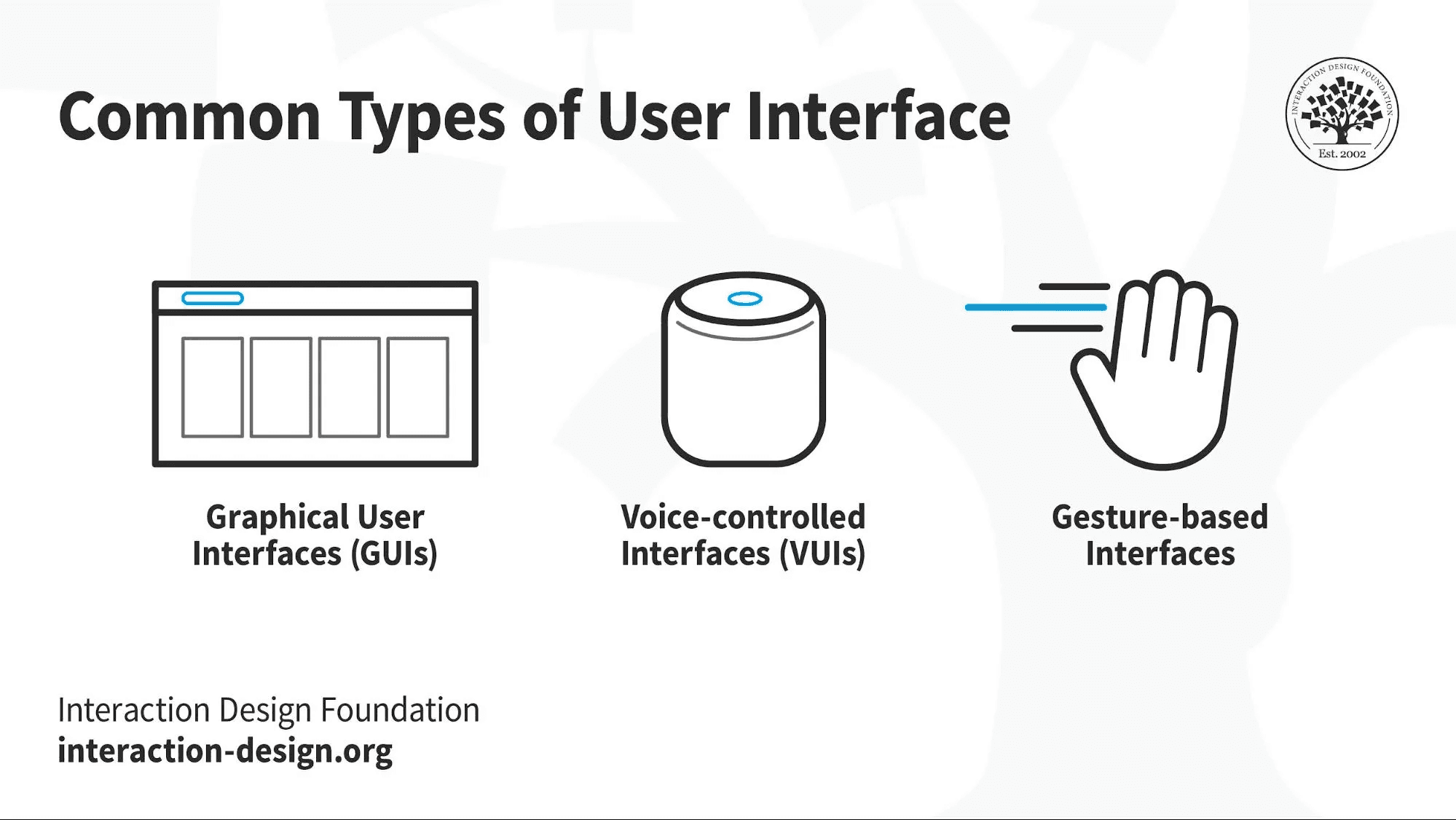
User Interface (UI) Design focuses on the visual aspects of a product—the look and feel, presentation, and interactivity. It's about designing interfaces that are aesthetically pleasing and intuitive, enabling users to interact with a product effortlessly. UI Design is a crucial component of the overall user experience, bridging the gap between users and the functionality of the product.
As Don Norman highlights:
"Good design is actually a lot harder to notice than poor design, in part because good designs fit our needs so well that the design is invisible."
A well-crafted UI not only attracts users but also makes the interaction seamless, reducing cognitive load and enhancing satisfaction.
The Relationship Between UX and UI Design
While UX Design focuses on the overall experience and functionality, UI Design zeroes in on the visual and interactive elements. They are complementary disciplines:
UX Design addresses the user's journey to solve a problem.
UI Design deals with how the product's surfaces look and function.
Together, they create a cohesive and engaging product.

Key Principles of UI Design
1. Consistency
Consistency in design elements—such as colors, typography, and button styles—helps users predict how things work, reducing confusion.
Visual Consistency: Uniformity in fonts, colors, and iconography.
Functional Consistency: Similar interactions for similar tasks (e.g., all clickable elements behave the same way).
2. Visual Hierarchy
Organizing elements to guide users' attention to the most important information first.
Size and Scale: Larger elements draw more attention.
Contrast: Using different colors or brightness to highlight key areas.
Positioning: Placing critical elements in prominent locations.
3. Clarity and Simplicity
Design should communicate effectively without unnecessary complexity.
Minimalism: Removing non-essential elements.
Readable Typography: Choosing legible fonts and appropriate sizes.
Clear Icons and Labels: Using universally understood symbols and concise text.
4. Feedback
Providing immediate responses to user actions.
Visual Cues: Highlighting buttons when hovered over.
Notifications: Informing users of successful actions or errors.
Animation: Subtle movements to indicate processing.
5. Affordances and Signifiers
Design elements should suggest their functionality.
Affordances: Elements like buttons and sliders indicate how they can be used.
Signifiers: Cues such as arrows or labels guide user interactions.
6. Accessibility
Designing interfaces accessible to all users, including those with disabilities.
Contrast Ratios: Ensuring text is readable against background colors.
Keyboard Navigation: Allowing users to navigate without a mouse.
Alt Text for Images: Providing descriptions for visually impaired users.
The UI Design Process
![Image: Flowchart showing the UI Design Process: Research ➔ Style Guide Creation ➔ Wireframing ➔ Mockups ➔ Prototyping.]
1. Research and Inspiration
Competitive Analysis: Studying similar products to understand industry standards.
Mood Boards: Collecting visual inspiration to define the aesthetic direction.
Design Trends: Staying updated with current design practices.
2. Creating a Style Guide
Establishing a consistent visual language.
Color Palette: Selecting primary, secondary, and accent colors.
Typography: Choosing fonts for headings, body text, and other elements.
Iconography: Defining the style for icons and graphics.
Components: Standardizing buttons, input fields, and other UI elements.
3. Wireframing
Sketching the basic structure of the interface.
Layout Planning: Determining the placement of elements.
Navigation Flow: Mapping out how users move through the product.
4. Designing Mockups
Creating detailed visual representations.
High-Fidelity Designs: Adding colors, typography, and imagery to wireframes.
Visual Details: Refining the aesthetic aspects.
5. Prototyping
Building interactive models to simulate user interactions.
Interactive Prototypes: Using tools like Figma or Adobe XD to create clickable prototypes.
Animation and Transitions: Defining how elements respond to user input.
6. Testing and Iteration
User Feedback: Gathering input on the visual design and interactions.
Usability Testing: Identifying issues with navigation or clarity.
Refinement: Making adjustments based on feedback.
Applying Don Norman's Principles in UI Design
Visibility
Make Important Elements Prominent: Ensure users can easily find key functions.
Avoid Hidden Features: Keep essential actions visible without the need for excessive exploration.
Mapping
Intuitive Controls: Design controls that correspond logically to their effects.
Spatial Relationships: Align elements in a way that reflects their hierarchy and connection.
Constraints
Limit Options: Reduce the chance of user error by constraining choices.
Disable Inactive Elements: Gray out buttons that are not currently usable.
Affordances and Signifiers
Design Buttons that Look Clickable: Use shading, borders, or 3D effects.
Use Familiar Icons: Employ universally recognized symbols (e.g., magnifying glass for search).
Case Study: Designing a Mobile Banking App Interface
![Image: Screenshot of a clean, user-friendly mobile banking app interface.]
Background: A bank wants to redesign its mobile app to improve user satisfaction and engagement.
Research and Inspiration
User Surveys: Customers expressed frustration with complicated navigation and unclear icons.
Competitive Analysis: Studied top banking apps for best practices.
Style Guide Creation
Color Palette: Chose calming blues and whites to convey trustworthiness.
Typography: Selected a clear sans-serif font for readability.
Iconography: Designed simple, meaningful icons for functions like transfer and deposit.
Wireframing
Simplified Navigation: Created a bottom navigation bar with essential functions.
Dashboard Layout: Prioritized account balance and recent transactions.
Designing Mockups
Visual Hierarchy: Used size and color to highlight critical information.
Consistency: Applied the same button styles throughout the app.
Prototyping
Interactive Elements: Enabled users to simulate transactions.
Feedback Mechanisms: Included confirmation messages for actions taken.
Testing and Iteration
Usability Testing: Users found the new design more intuitive.
Feedback: Adjusted icon sizes and improved contrast based on user input.
Results
Increased Engagement: Noticed a 20% increase in daily active users.
User Satisfaction: Positive feedback regarding ease of use and aesthetics.
Tools and Resources for UI Designers
Design and Prototyping Tools
Figma: Collaborative interface design tool.
Sketch: Popular design software for Mac users.
Adobe XD: Tool for designing and prototyping user experiences.
Icon Libraries
Material Icons: Google's icon set adhering to Material Design guidelines.
Font Awesome: Extensive collection of scalable icons.
Color and Typography Resources
Adobe Color: Tool for creating and exploring color palettes.
Google Fonts: Free library of web-friendly fonts.
Inspiration Platforms
Dribbble: Community showcasing user-made designs.
Behance: Platform to discover creative work.
Actionable Tips for Effective UI Design
Know Your Users
Understand user preferences and needs.
Design interfaces that resonate with your target audience.
Prioritize Content
Highlight the most important information.
Remove unnecessary elements that clutter the interface.
Use Whitespace
Provide breathing room between elements.
Improve readability and focus.
Be Consistent
Maintain uniformity in design elements.
Use the same styles for buttons, fonts, and colors.
Test on Multiple Devices
Ensure the design is responsive and works well on different screen sizes.
Check for consistency across platforms.
Seek Feedback
Regularly gather input from users and stakeholders.
Be open to constructive criticism and ready to iterate.
Accessibility Considerations
Color Contrast: Use sufficient contrast between text and background.
Text Alternatives: Provide alt text for images and icons.
Scalable Text: Allow users to adjust font sizes without breaking the layout.
Keyboard Navigation: Ensure all interactive elements can be accessed via keyboard.
Conclusion
UI Design is a vital aspect of creating products that not only function well but also provide an enjoyable and intuitive experience. By applying fundamental design principles and focusing on the user's needs, designers can craft interfaces that are both beautiful and effective.
Remember Don Norman's insight:
"Beauty and brains, pleasure and usability—they should go hand in hand."
As you continue your journey in product design, remember that every visual element contributes to the user's experience. Strive for designs that are not just visually appealing but also enhance usability and satisfaction.
Next Steps
In the next chapter, we will explore Interaction Design Principles, delving into how users interact with products and how to design intuitive and engaging interactions.


